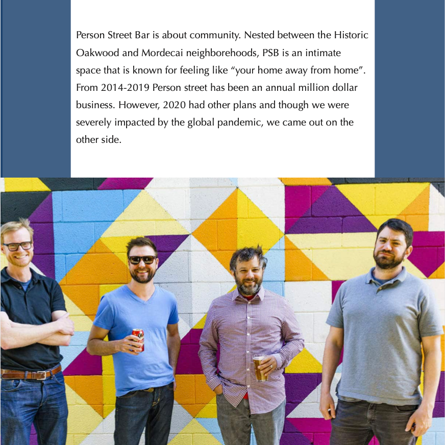
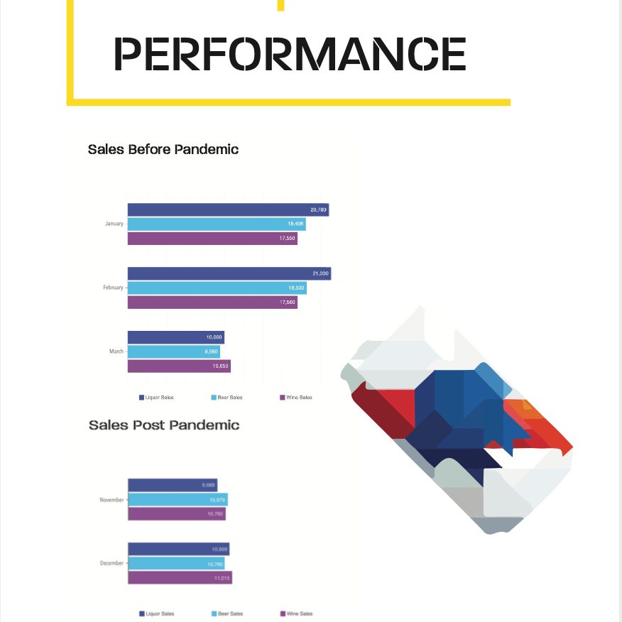
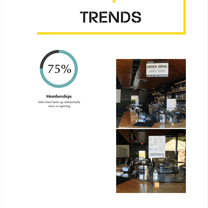
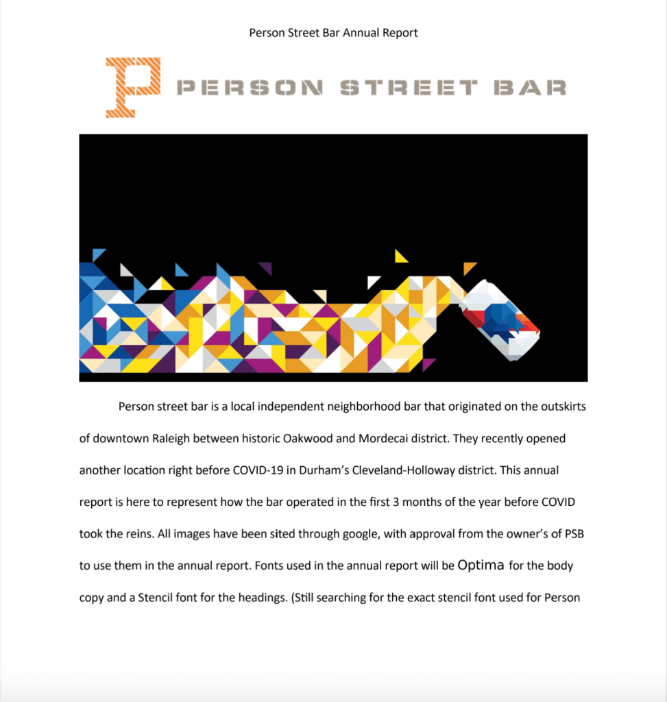
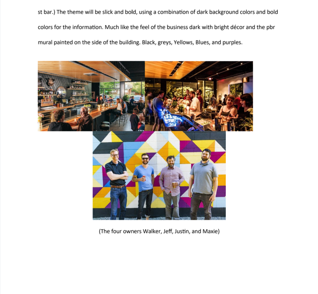
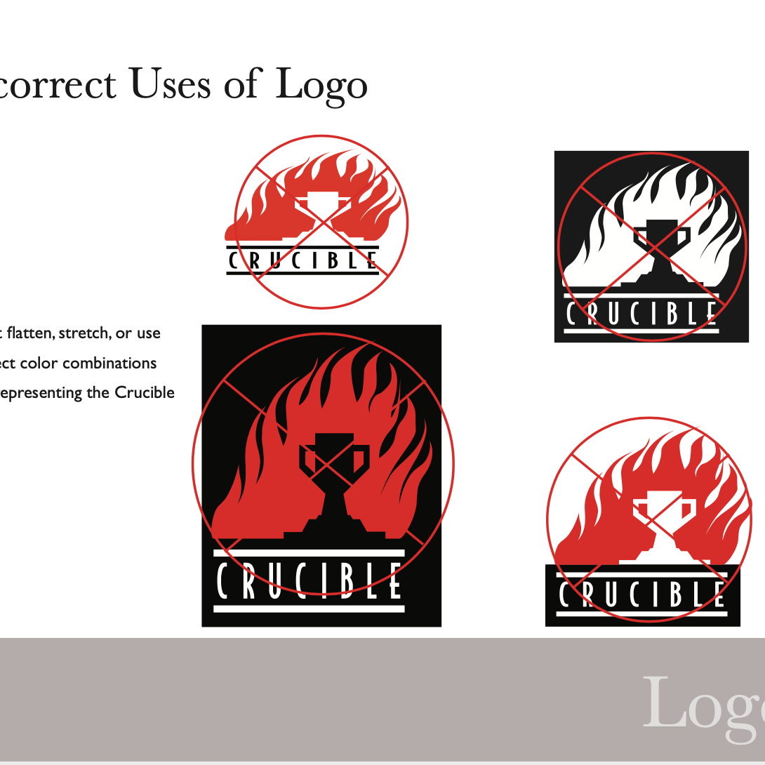
For this project we were asked to create a pattern to use for the brand identity of our product label.
The Process
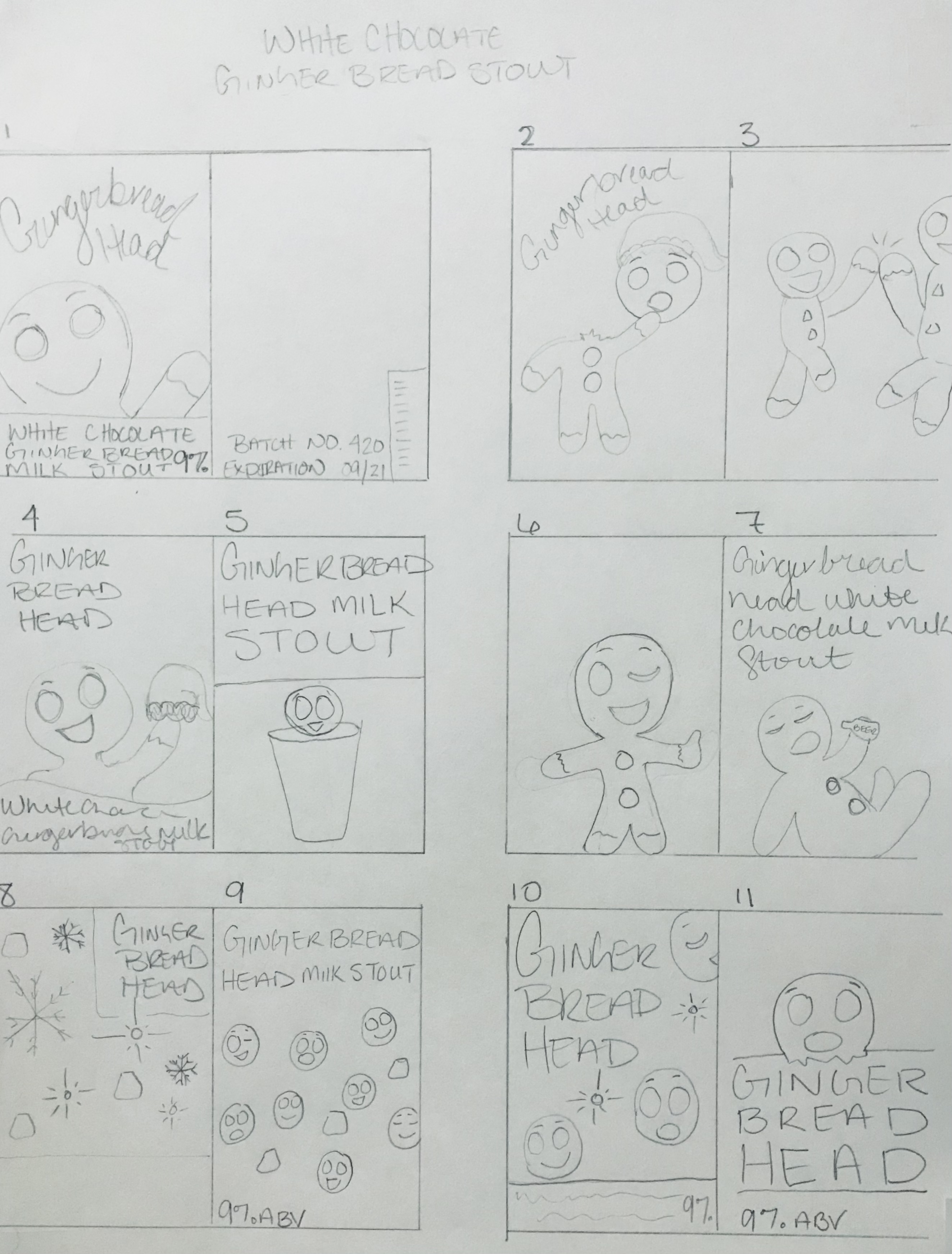
Sketches
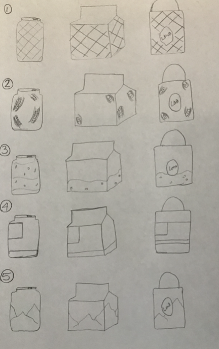
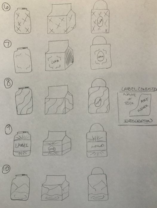
I leaned more towards design 5 and 8 in my original concepts and went on to create digital roughs of each pattern.
Digital Roughs
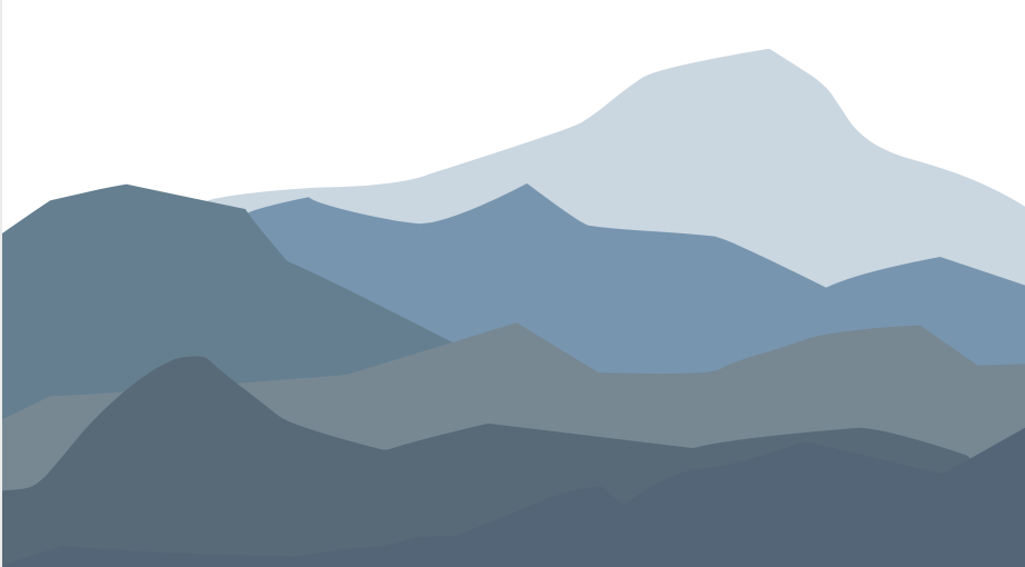

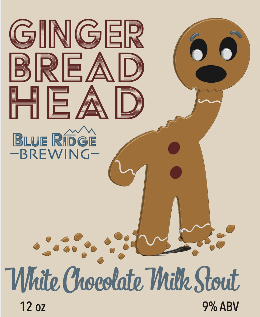
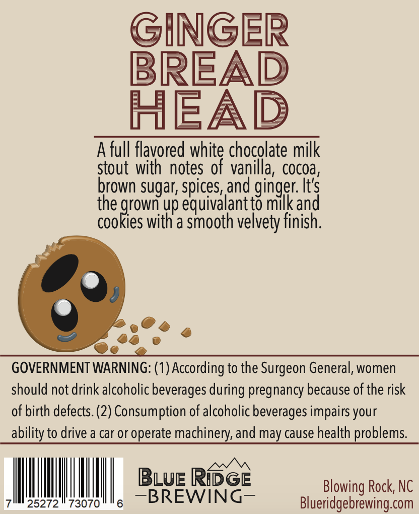
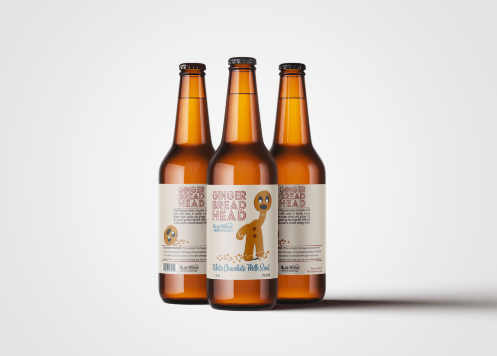
After trying each design on my product label I decided to go with the mountain landscape to tie into the products brand identity. Blue Ridge Brewing located in Blowing Rock North Carolina. The blue ripples were interesting but fell flat after looking at it all together.
Completed Brand
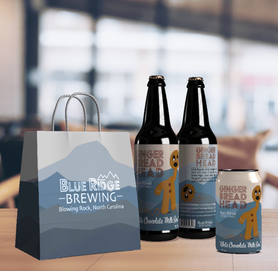
The idea behind my final product is that every beer Blue Ridge Brewing creates will have the mountain scene in the background and the colors will vary depending on the style of beer.